Hershey
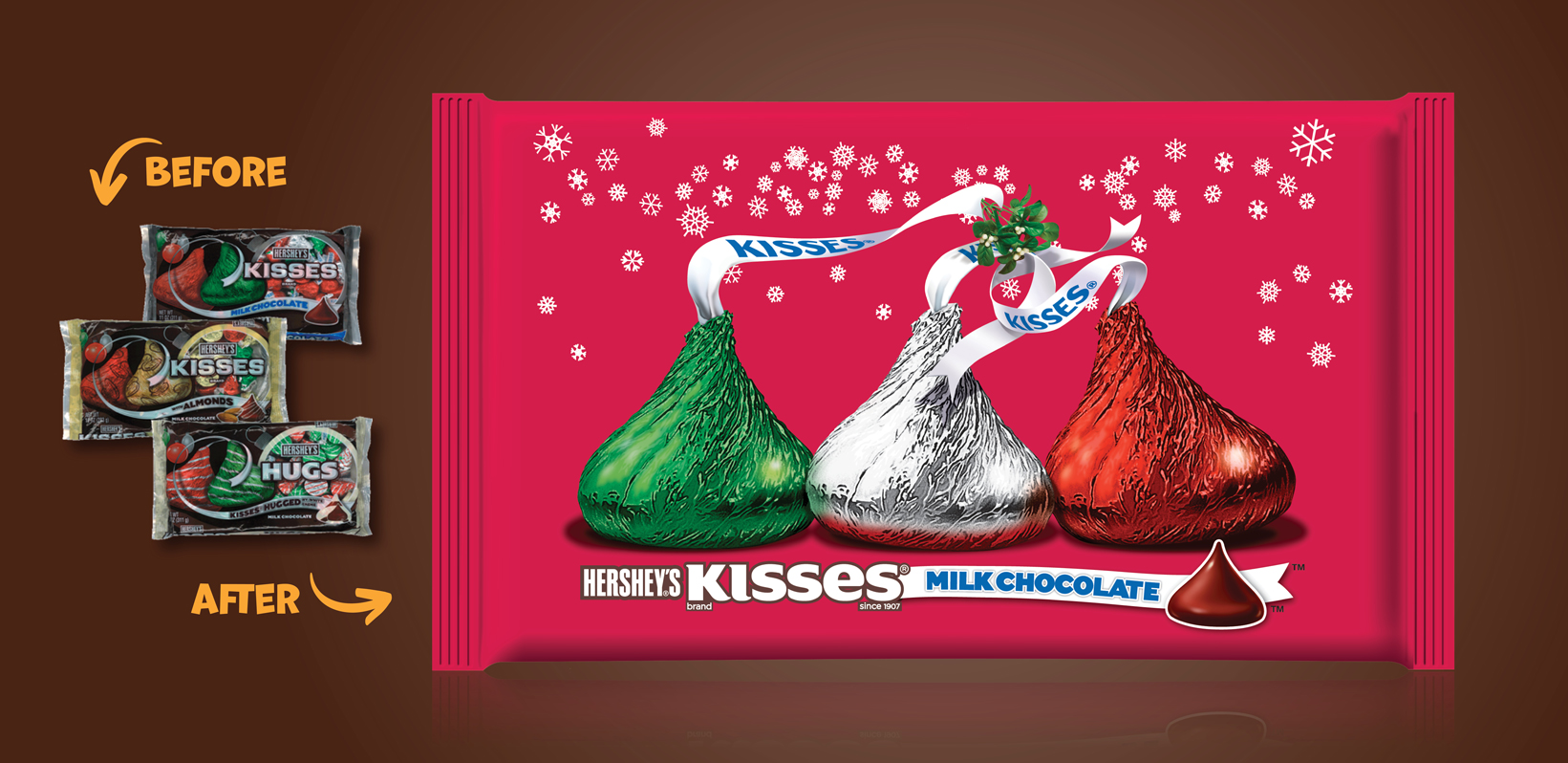
Kisses
When Hershey feared that its Holiday packaging was getting lost on the shelves, we were tasked with creating a design that would increase impact and presence during the most important time of the year. We couldn’t allow these iconic holiday candies to be hidden among the rest!
So, by liberating the famous kisses shape and adding personality to the instantly recognizable plumes, we found a simple, but incredibly effective approach that really made the package pop on shelves!
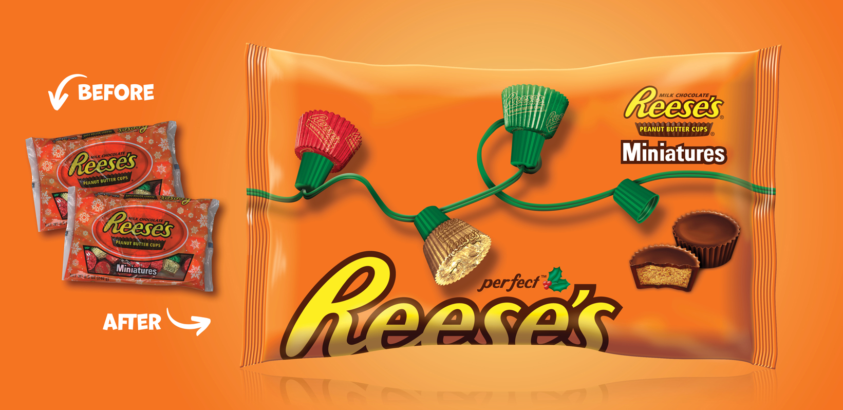
Reese's
This innovative “shoulder architecture” proves that iconic branding is powerful, durable, and flexible. Our original design features the Reese’s name on the shoulder of the bag, so that when bags are stacked on the shelf, it’s easier for consumers to see the brand name as they shop.
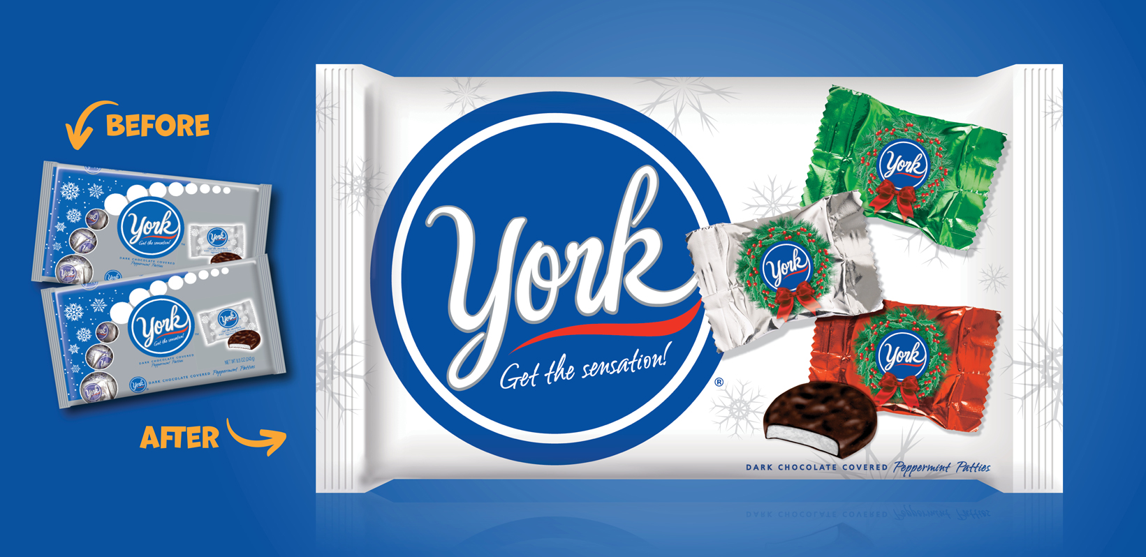
York Peppermint Patties
To elevate the look and feel of the York brand throughout the holiday season, we departed from the battleship grey color on packaging and opted for a lighter, brighter shade that reminded us more of “silver bells”.